There has been already one great mapping project featured on my blog - an amazing performance for the 600th anniversary of the famous Prague clock. And here's a really nice follower or a challenger which deserved being here among the best picks of the day. Enjoy this awesome mapping performance from Amsterdam...and decided who was better...
Tweet
11/30/2010
Star Wars characters typography posters
That's just one word - AWESOME! Amazing self promo by H57 which has already caused a lot of buzz online... So, time for you to know what's that's all about... Enjoy this typography only (!) posters of the Star Wars characters... My fave is a Stormtrooper...
Tweet
Tweet
Мітки:
design,
graphic design,
poster,
Star wars,
typography
Great identity design for Hot Cup Cold Spoon by Drew Roper
Following a really great identity design for Frank, here is one which is a good answer to the quality and details challenge set by the Frank identity. All details of the given identity pack, including textures, colors, patterns are all made with a lot of attention having been paid to the details. Drew Roper who designed all this is just a grad to be from University of Missouri and with such an amazing start I bet a bright future is ahead for this young designer...
Tweet
Tweet
Мітки:
design,
graphic design,
identity,
packaging
11/29/2010
Designer greeting cards for Chisrtmas
Just in case you are already thinking on the way you gonna greet your dear and beloved ones, here's a nice site to consider... All I Want For Christmas Cards
Tweet
"The All I want for Christmas cards project is an annual festive project in support of the Bristol based charity “Young Bristol”. Now into its second collection the project brings together 20 illustrators from around the country whose specific works for the project have been used to create a limited edition collection of Christmas cards that will be sold as packs containing each of the 20 cards.
Hand-picked inspirations of the day: Day 76
Designs, designs, designs.... When you spend most part of the day designing, then there's a moment when it's really hard to digest some more designs whatever great they are...And still I do it :) Looking through dozens if not hundreds of links to get those few which are interesting and worth sharing with you...
Thanks MrLomo for the image
Tweet
Thanks MrLomo for the image
Tweet
5 best inspirations of the week. Week 17
Another week, though a short one in terms of number of posts, is over and it's time to sum it up... Most of the inspirations turned to be those out of graphic design domain, though one product design caught attention of many of you and well deserved its place in the top 5 of the week that passed.
Tweet
Tweet
Мітки:
design,
fur,
graphic design,
illustration,
inspiration,
poster,
print,
product
11/28/2010
An interesting packaging design from Adam M. Gerstner
A pretty creative idea and design for Miracle elexirs. Great font treatment for labels, and just stunning packaging. Adam managed to capture the spirit of the time the elexir refers to. Well done!
Tweet
Tweet
BYOT - an interesting tea packaging concept from Sanctuary T.
Thought the best tea packign so far is still one made by Sarah Dery, but this one also deserves attention and is worth being mentioned here...
First of all a really nice idea to carry and brew loose leaf tea unlike all those tea-bagged options where one can never be sure of the quality of the tea inside... And the packaging idea is also great. It reminded me of the tobaco leaves pouch... Which is actually pretty similar :) And of course the color scheme, great use of typography and minimalistic design make those pouches really attractive and fun to carry...
Thanks Dieline for inspiration
Tweet
Мітки:
design,
graphic design,
packaging,
product,
tea
Classic Muscle - a nice identity and packaging design by Kyle Fletcher
A really nice concept and packaing design for a dietary supplement for men. There's something masculine in it... Something rough, brutal, yet rather appealing and attractive. Great job, Kyle Fletcher!
Thanks Dieline for inspiration
Tweet
Thanks Dieline for inspiration
Tweet
Мітки:
design,
graphic design,
identity,
packaging
11/27/2010
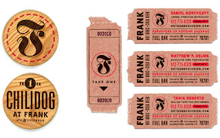
A great identity design for Frank by Helmsworkshop
Whenever I see a really detailed approach towards identity design when all elements are taken into account I can't but admire and respect those who do it. And even more, when such a well thought and designed set is seen, it's pretty obvious for me how much work, brains and creativity have been put into it by the entire team. And I do believe that only team can produce such results, whatever creative a single designer is...
So, here it comes - great identity design made by Helmsworkshop for Frank.
Thanks dieline for the inspiration
Tweet
So, here it comes - great identity design made by Helmsworkshop for Frank.
Thanks dieline for the inspiration
Tweet
Мітки:
design,
graphic design,
identity,
packaging
Subscribe to:
Comments (Atom)


